
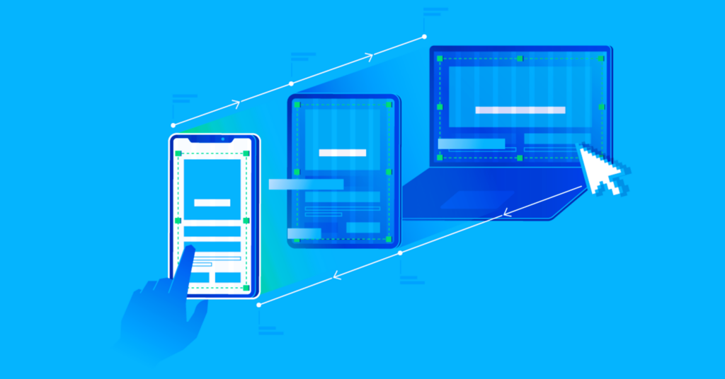
With the rapid rise in mobile device usage, ensuring a seamless user experience across different screen sizes has become a necessity. Responsive web design (RWD) allows websites to automatically adapt to various devices, ensuring optimal usability and accessibility. This article explores why responsive design is crucial for mobile users and how it benefits both users and businesses.
1. Improved User Experience
A responsive website enhances the overall user experience by providing a consistent and visually appealing layout across all devices. Key benefits include:
- Seamless navigation: Users can easily access content without excessive zooming or scrolling.
- Faster load times: Optimized images and adaptive elements ensure quick loading speeds.
- Better readability: Text and images automatically adjust for clarity on smaller screens.
2. Increased Mobile Traffic
Studies show that over half of global web traffic comes from mobile devices. Without a mobile-friendly design, businesses risk losing a significant portion of their audience. A well-implemented RWD ensures accessibility to a broader user base, increasing traffic and engagement rates.
3. Higher Search Engine Rankings
Search engines like Google prioritize mobile-friendly websites in their rankings. In fact, Google’s mobile-first indexing means that search engine bots primarily crawl the mobile version of a site. Websites that lack responsive design may experience lower rankings, reducing their visibility in search results. More information on Google’s mobile-first indexing can be found on Wikipedia.
4. Cost and Maintenance Efficiency
A responsive website eliminates the need for separate desktop and mobile versions, reducing development and maintenance costs. With a single adaptive site, businesses can:
- Save time and resources on updates.
- Ensure consistent branding and functionality.
- Avoid the complexities of managing multiple site versions.
5. Improved Conversion Rates
A mobile-friendly experience translates to higher conversion rates. Users are more likely to complete actions such as making purchases, signing up for newsletters, or filling out forms when the process is seamless. A non-responsive site may frustrate visitors, leading to abandoned transactions and lost revenue. The role of software testing in game development, read our beginner’s guide.
6. Compatibility with Future Devices
Technology is constantly evolving, with new screen sizes and resolutions emerging regularly. Responsive design ensures that websites remain adaptable to future devices, safeguarding long-term usability and relevance.
Responsive design is no longer a luxury but a necessity for businesses and content creators looking to thrive in a mobile-first world. By enhancing user experience, boosting search engine rankings, and improving conversions, RWD ensures a competitive edge in the digital landscape. Investing in responsive design today will lead to long-term benefits for both users and businesses.